Typography | TASK 1 : Exercises


22.4.25 - 20.5.25  |  Week 1 - 5

Haley Alexandra Gray  |  0369029  |  Bachelors of Design in Creative Media

Typography GCD60104

Task 1  |  Exercises


Table of Content :


Lecture Material

Typography GCD60104


Week 1 (Introduction & Development)
0. Introduction / Typo 1

- Typography is a fundamental aspect in any design study. It develops attributes that are fundamental to any discipline; attention to detail, composition, etc, as well as develop skillsets that are applicable to all design areas. It is the creation of typefaces, which can be applied in  many different facets of life; in animated forms, influences designs of websites, app designs, signage design, logos, etc.

- Typography is full of terminologies, conventions, and unwritten rules depending on disposition / influences regarding to style. It is beneficial to any discipline, has a baring on how you presents your information, and communicate effectively. The practice of typography are seen in work of typesetters, compositors, typographers , graphic designers, art directors, artists and anyone who arranges words, letters, numbers and symbols. Typography is something now everyone does, through the advancement of technology and digitisation of design.

Terminologies - 

Calligraphy - writing styles (write the letters)
Lettering - when you draw the letters out
Font - refers to individual font or weight within the typeface
Typeface - refers to the entire family of font or weights that share similar charactersitcs / styles.

1. Development
- Typography Timeline :

Phoenician to Roman
- Previously, writing meant scratching into clay with sharp apparatuses or carving stones, and have since then evolved out of the use of those tools/materials, to uppercase letterforms; a combination of straight lines and pieces of circles.

- Modern letters can be derived from the Phoenician alphabet.

- Greeks changed direction of writing, where they developed a tsyle of writing called boustrophedon, meaning the lines of text read alternately from right to left, vice versa after the line, changing the direction of reading and orientation of letterforms. Conventional methods at the time was writing from right to left.

- Etruscan carvers working on marble painted letterforms before inscribing them. Certain qualities of their strokes influenced the letterform evolution.

Fig.1 Progression from Phoenician to Greek to Roman letters | from lecture Typo_1_Development

Handscript from 3rd - 10th century CE

- Square capitals were written versions found in Roman monuments. These letterforms had serifs added to the finish of the main strokes and the variety of stroke width was achieved through holding the pen at an angle.

- Rustic capitals (compressed version of square) allowed for twice as many words on a sheet of parchment and took less time to write. The pen / brush was held at a 30º angle off the perpendicular. However convenient, they were harder to read due to the compressed nature

- Square and rustic capitals were reserved for documents of some intended performance. Everyday transactions utilised cursive, simplified for speed; that was the beginning of lowercase letterforms.

- Charlemagne issued an edict in 789 to standardise the ecclesiastical texts. Monks rewrote texts using majuscules (uppercase), minuscules, capitalisation, and punctuation.

Blackletter to Gutenberg's type

- The dissolution of Charlemagne's empire came regional variations upon Alcuin's script. In northern Europe, a condense, strongly vertical letterform known as Blackletter gained popularity. In the south, a rounder more open hand called Rotunda was prominent.

- Glutenberg's type mold required a different brass matrix, or negative impression, for each letterform.

Text Type Classifications

  • 1450 - Blackletter
  • 1475 - Oldstyle
  • 1500 - Italic
  • 1550 - Script
  • 1750 - Transitional
  • 1775 - Modern
  • 1825 - Serifs
  • 1900 - Sans Serifs
  • 1990 - Serif / Sans Serif

Week 2
2. Typo 3 | Part 1

Kerning : Refers to the automatic adjustment of space between letters. 
                    - Often mistaken for letter spacing (letterspacing is to add space between the letters)
                    - Uppercase letters usually uses more kerning - more presentable and readable

Tracking : the addition and removal of space in a word or sentence
    - Normal tracking - Loose tracking - Tight tracking
    - when you increase or decrease letter spacing for words / sentences you are reducing the readability & detectability of patterns
    - Affects colour of the text - loosely set text creates a lighter colour, vice versa.
    - Focus on the negative and positive space that make up the words
- Strong resistance within the type community to letterspace lowercase letters within text
- Uppercase letterforms are designed to stand on their own - lowercase letterforms require counterform created between letters to maintain the line of reading

Text formatting
- Flush left - Closely mirrors asymetrial experience of handwriting
    - Each line starts at same point but ends wherever the last word on the line ends.
    - Spaces between the words are consistent throughout text

- Centred - format imposes symmetry upon text
    - assigning equal value and weight to both ends of any line.

- Flush right - format places emphasis on the end if a line as opposed to its start
    - useful for situations like captions / relationship between text and image may be ambiguous

- Justified - Like centering, this format imposes a symmetrical shape on the text. 
    - Achieved by expanding or reducing spaces between words and, sometimes, between letters.
    - Resulting openess of lines can produce rivers (gaps through the text)

- Beyond learning about the unique characteristics of each typeface and understanding its history, it is important to understand how different typefaces feel as texts.
    - Different messages suit different typefaces.

Fig. 2 Anatomy of a Typeface | from lecture Typo_3_Text Part 1

- Goal in setting text type is to allow easy, prolonged reading
    - Type size = Text type should be large enough to be read easily at arms' length
    - Leading = Text that is set too tightly encourages vertical eye movement a reader can easily lose their place. Type that is set too loosely creates striped patterns that distract the reader from the material.
    - Line length = Shorter lines require less time to read, opposed to long lines. Good rule of thumb is to keep line length between 55-65 characters.

- Type specimen book shows samples of typefaces in various different sizes. It is to provide an accurate reference for type, type size, leading, length, etc.

Fig. 3 Text Specimen Sheet | from lecture Typo_3_Text Part 1

- Compositional requirement : Text should create a field that can occupy a page or screen
- Ideal text has a middle-grey value.


Week 3
3. Typo 4 | Part 2

Paragraphs
- Pilcrow : a symbol that indicates paragraph spacing.
    - a holdover from medieval manuscripts used today

- Leading should be about 2.5-3 pts more than the typeface size.
- Leading and paragraphs should have the same value (pts) to ensure cross-alignment across columns of text

- Line space vs leading :
    - Leading is the space you see between two sentences
    - Line spacing takes into consideration the baseline of the base sentence to the descender of the other sentence.

Fig. 4 Line space vs leading, Nick Sherman

- Another way to indicate paragraph spacing is through indentation 
    - Indent is the same size as the line spacing / typeface size. 
    - Best used when text is justified - to avoid ragging on both sides.

Widows & Orphans
- Widow : a short line left alone at the end of a column of text.
- Orphan : a short line of type left alone at the start of new column.

Highlighting Text
- With large amount of texts comes important information within.
    - Italics
    - Bold
    - Change typeface
    - Change colour - cyan, magenta, black only
    - Placing typographic elements outside the left margin | opposed to indenting (-)
    - Quotation marks

Headlines
- Make sure heads clearly signify to the reader the relative importance within the text and to their relationship to each other.

    - A head indicates a clear break between topics within a section    
        - A heads are set larger than the text.
        - Capitalised and bold.
    - B head is subordinate to A heads.
        - Indicate a new supporting argument / example for topic at hand.
        - Should not interrupt the text as strongly as A head
        - Shown in small caps, italic, bold serif / san serif.
    - C heads highlight specific facets of material within B head text
        - Shown in small caps, italic, bold serif / san serif.
        - In the same paragraph as B head

- Putting together a sequence of subheads = hierarchy

Cross Alignment : reinforces the architectural sense of the page (the structure) while articulating the complementary vertical rhythms.


Week 4
4. Typo 2 Basic

Baseline : The imaginary line of the base of the letterforms
Median : Imaginary line defining the x-height of letterforms
X height : Height in any typeface of the lowercase 'x'
Stroke : Any line that defines basic letterform
Apex / Vertex : Point created by joining two diagonal stems
Arm : Short strokes off the stem of the letterform
Ascender : Portion of the stem of a lowercase letter form that projects along the median line
Barb : Half serif finish on some curved stroke
Beak : half serif finish on horizontal arms
Bowl : rounded form that describes a counter - open or closed
Bracket : Transition between serif and stem
Cross stroke : horizontal stroke in a letterform that joins two stems together
Crotch : interior space where two strokes meet
Descender : portion of letterform that projects below baseline
Ear : Stroke extending out from main stem / letterform
Em/en : Em is the distance equal to the size of the typeface, En is half the size of an em.
Finial : Rounded non-serif terminal to a stroke
Ligature : the character formed by the combination of two or more letterforms
Spine : The curved stem of the 'S'
Stress : Orientation of the letterform indicated by the thin stroke in round forms
Swash : the flourish that extends the stroke of the letterform
Tail : Curved diagonal stroke at the finish of certain letterforms
Terminal : Self-contained finish of a stroke without a serif


- End -


Instructions


MIB for Typography GCD60104 | The Design School at Taylor's University 2025


Task 1 | Part 1

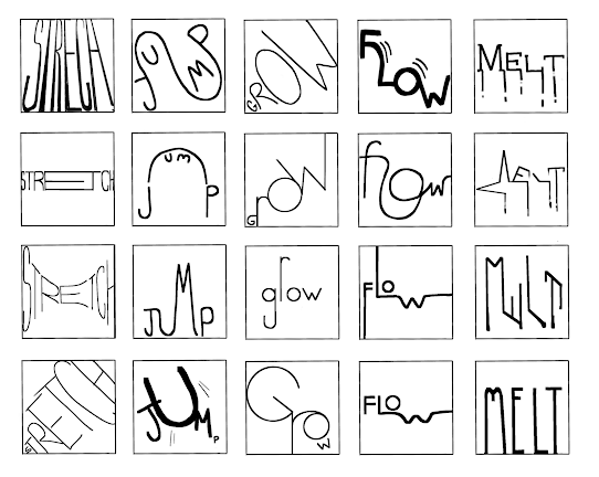
For the first part of this module, we are tasked with exercises to help us practice and get better at typographical skills and enhance our knowledge. We started off with Type expression where we had to create 4 words that reflected their meaning through typography.


Visual References
6 Words - Interpretations


Stretch - A very straightforward interpretation, where just manipulating (stretching) the fonts was my main idea. Thought about stretching as in the exercise, however it might be have too many external elements or become distorted.

Fig. 5 Stretch References (22/4/25)


Shake - Another straightforward idea, where the individual letters would be jumbled as if being shaken in a box, or being shook altogether, not a lot of solid ideas had been thought of. 

Fig. 6 Shake References (22/4/25)


Jump - I took inspiration from the actions / build up towards the jump and the actual jump performed by humans.

Fig. 7 Jump References (22/4/25)


Grow - The definition of grow according to the Oxford Dictionary is 1. (of a living thing) undergo natural development by increasing in size and changing physically, or 2. become larger or greater over a period of time; increase. This gave room for more interesting and natural designs rather than just replicating a verb such as plants and animals growing from the word itself.
Fig. 8 Grow References (22/4/25)


Melt - Initial thoughts were of ice and candles, and melting in general.


Fig. 9 Melt References (22/4/25)


Flow - Took inspiration from flowing water/waterfalls and flowing lines.

Fig. 10 Flow References (22/4/25)

Preliminary sketches

Started off with some on-the-surface ideas on paper about the explicit meanings of the words, the developed them further digitally and branched out to more in-depth meanings and expressions.

Fig. 11 Preliminary sketches before Feedback on paper (22/4/25)

Fig. 12  Preliminary sketches before Feedback (26/4/25)
-
After feedback, I altered the designs to further develop the ideas and organised them according to how I could/was able to format them in Adobe, and dropped the word shake to focus more on the words that I could potentially use for my 4.

Fig. 13  Preliminary sketches after Feedback (29/4/25)

Digitisation

Digitised almost all of the designs from the previous development stage to experiment with the 10 fonts provided and to see what design suited what font, and how to change the composition to suit the words in Adobe.

Fig. 14 Digitisation before Feedback (1/5/25)

Digitisation after Feedback -

Fig. 15 'Stretch' Development (8/5/25)

Stretch

Ms. Vitiyaa suggested approval of the expression of stretch, so I explored other ways to interpret and design the word, playing with gradients to show a thinning in the middle, and the orientation to replicate the effect of stretching something.


Fig. 16 'Melt' Development (8/5/25)


Melt -   

In the previous digitisation   process, I experimented with a   design that used serifs' as a way  to express melting, and explored  more on that and developed  through the feedback given, as  well as thinking of new  interpretations to use for my final  4. 


Fig. 17 'Jump' Development (9/5/25)


Jump -

I was not satisfied with my previous attempts at the word jump, and so received some pointers on how to improved and worked from there to generate new ideas that I liked.


Flow -

Originally, I thought this design would have been my final one, so I tried to develop it and give it more character and detail, however it looked like the flowing water was another letter, perhaps 'n'.


Fig. 18 'Flow' Development (9/5/25)


Final Choices -

Flow, Jump, Stretch, & Melt.
Fig. 19 The Final words I decided to choose (13/5/25)


_ _ _ _ _ _ _ _ _ _ _ _ _ _ _ _ _ _ _ _ _ _ _ _ _ _ _ _ _ _ _ _ _ _ _ _ _ _ _ _ _ _ _ _ _ _ _ _ _ _ _ _ _ _ _ _ _ _ _ _ _ _ _ _ _ _ _ _ _ _ _ _ _ _


GIF Process -

After choosing the final words and finalising them, we had to animate them and create a short GIF; of the words putting their meaning to action. The word I chose was Melt as I thought it would be and look interesting to do. 

Part 1: Frame making (Adobe Illustrator)
- Created the individual frames and edited / manipulated the word as needed to create the effect.

Fig. 20 Animation process - Duplicating and editing frame per frame (14/5/25)

Fig. 21 All of my layers in Adobe Illustrator (14/5/25

Part 2: Animation Process (Photoshop)
In the next stage, it was compiling all the frames and putting them in sequential order to create the final form of the GIF, as well as see where needs improvement, and set the SPF.

Fig. 22 Animation (15/5/25)


_ _ _ _ _ _ _ _ _ _ _ _ _ _ _ _ _ _ _ _ _ _ _ _ _ _ _ _ _ _ _ _ _ _ _ _ _ _ _ _ _ _ _ _ _ _ _ _ _ _ _ _ _ _ _ _ _ _ _ _ _ _ _ _ 

Final Outcome

The final outcome for this part would be 4 words designed to their meaning, as well as an animated GIF pertaining to their meaning.

4 Words Final Outcome -
Fig. 23 Final Compositions [JPEG] (14/5/25)


Final Compositions [PDF] (14/5/25)

GIF Outcome -
Fig. 23 Final GIF [GIF] (16/5/25)


Task 1 | Part 2

For Exercise 2, we were tasked with creating 1 A4 formatted document to demonstrate what we learned from the lectures and tutorials provided to us. 4 video assignments were posted for us to follow, to pratcice for our projects currently and later on. Here are my attempts :

1/4 :
For this exercise we practiced kerning and tracking of our names in the 10 different fonts provided to us.

Fig. 24 Kerning & Tracking 1/4 (17/5/25)


2/4 & 3/4 :
This exercise was about paragraphing and formatting our document, with the utilisation of leading, baselines, grids, and columns, as well as inserting photos for formatting.


Fig. 26 Kerning & Tracking 3/4 (18/5/25)

              
                 Fig. 25 Kerning & Tracking 2.4 (18/5/25)


4/4 : INDIVIDUAL DESIGN TASK

This exercise being the final exercise is where we create our own layout design, applying all the techniques learned in the previous tasks.

Visual Inspiration / Research -

Fig. 27 Visual Research | Exercise 4/4 (19/5/25)
Chosen Image -

Fig. 28 Chosen Image for Layout | Karen Smithey, Pinterest


Layout Exploration -

I've experimented with different formatting styles, as well as using the font size of 9 to maintain around 55-65 characters in a line, as well as 11 pt leading throughout / 11 pt paragraph spacing.

Fig. 29 8 Layout Explorations (19/5/25)

I realised that this text might not have a subtext that goes under the title, I just assumed it would be that case, so I made the changes to add that piece of text back into the paragraph.

Fig. 30 8 Layout Explorations | Edited (19/5/25)

Decided to go with this layout -

Fig. 31 Decided Layout (20/5/25)

After Feedback :

Fig. 32 Composition during Feedback (20/5/25)
   - Changed the grids to match the layout

    - Adjusted the kerning to make the text 
      paragraphs look even (not loose / tight)

    - Lowered the image to create more balance

    - Realised that the characters per line had too 
      many (above the range of 55-65), so I had to 
      adjust accordingly, and increase the text size 
      while trying to keep the same layout overall.


Fig. 33 Updated outcome after feedback (20/5/25)


_ _ _ _ _ _ _ _ _ _ _ _ _ _ _ _ _ _ _ _ _ _ _ _ _ _ _ _ _ _ _ _ _ _ _ _ _ _ _ _ _ _ _ _ _ _ _ _ _ _ _ _ _ _ _ _ _ _ _ _ _ _ _ _ 

Final Outcome


Head Line :
Typeface: ITC New Baskerville STD
Font/s: ITC New Baskerville STD Bold
Type Size/s: 39 pt
Leading: 36 pt
Paragraph spacing: 0

Body :
Typeface: ITC New Baskerville STD
Font/s: ITC New Baskerville STD Regular
Type Size/s: 10 pt
Leading: 12 pt
Paragraph spacing: 12 pt
Characters per-line: 61
Alignment: Left-Align
Margins: Top = 21 mm, Bottom = 22 mm, Left = 0 mm, Right = 14 mm
Columns: 2
Gutter: 0 mm, (13 mm between original gutter and manual guide line)

Fig. 34 Final JPEG without grid (20/5/25)

Fig. 35 Final JPEG with grids (20/5/25)


Fig. 36 Final PDF without grid (20/5/25)

Fig. 37 Final PDF with grids (20/5/25)


Feedback

Week 1 (22/4/25)

General Feedback : We had a general briefing of the subject and rules, chose 6 words and started on ideating and sketching them out - think outside the box & find deeper meanings within the chosen words. Bring numerous ideas next week for development and feedback, as well as view the lecture and look at the 10 fonts given.

________

Week 2 (29/4/25)

Specific Feedback : Put sketches in a box to visualise the full display and make it orderly, choose 4 words to digitise. "Grow" words are too distorted, "Melt" words have potential - except for the ones that are vertically positioned. Complete by next week's class.

General Feedback : Complete preliminary sketches and start on digitising them for next weeks' class.  

________

Week 3 (6/5/25)

Specific Feedback : "One" stretch word has potential, look back at design principles to further develop, try nre compositions with jump, make melt word feel more melty (opacity gradient, drippy)

General Feedback : Use the 5W1H to further develop the words and for animation, and continue the digitising process. 

________

Week 4 (13/5/25)

Specific Feedback : 4 words are fine, proceed with animation and task 1 part 2.

General Feedback : Complete animation, upload and update the eportfolio,  do task 1 exercise 2 complete before next week's class.

________

Week 5 (20/5/25)

Specific Feedback : Regarding task 1 part 2, adjust kerning (not too tight or loose), adjust the image to be in balance with the rest of the composition, and remove any widows and/or orphans. To be completed today, E-portfolio submission on Friday.

General Feedback : Complete Task 1 Part 2 and E-portfolio, and start Task 2.


Reflection

Experience : 

During these first few classes and tasks, I have developed more awareness to what Typography actually is, and how meticulous you have to be to have a good, accurate design. Having not really known the depth of Typography, I went into this module thinking it would be something easy and light. I was mistaken.. However, it was interesting to learn more about lettering, history of fonts, all the terminologies, and what/what not to do, which I'm sure will benefit me later on. As well as that, the exercises were enjoyable to me, trying to create a new design to interpret words, and the formatting exercise - it made a good  introduction and starting point for me to Typography, and I am happy with the outcome of these classes so far. I have also gained more experience with using Adobe Illustrator and InDesign.

Observations :

I have observed that Typography is more than just text-based designs and such, it is way more than that, and it has never occured to me before but it is definitely an art form. Like designing other things, planning and preliminary designs are crucial to getting to where you want to be in Typography, and using the various softwares needed require a lot of time to familiarise yourself with. I have also noticed that even if we think our designs feel original, there is a chance someone around you has thought of it as well, so there has to be extra effort and creativity when coming up with new ideas to use in our assignments, as well as outside the classroom. That being said, Typography is quite time consuming, and I am going to have to be careful about time management, however after being in Mr Vinod's class in semester 1 for DP (who is the head of the Typography module I think), I am familiar with how to get my tasks in order and the requirements we have to do each week generally on time.

Findings :

Overall, I have found Typography to be challenging yet rewarding and interesting in it's own way. I have found out more on the origin of fonts and letters, as well as gaining Adobe Illustrator and InDesign skills to carry out the tasks. The work itself taught me alot about how certain fonts and designs can change the appearance / effect of the word drastically, and to choose the appropriate one takes a lot of planning and exploration. In the future, I believe I have to be more open minded about changes I have to make in my designs, as I find myself reluctant to change, leading me to put out less ideas/explorations.


References

Afreen. J. (n.d.). Melt. Pinterest. Online URL : https://uk.pinterest.com/pin/589408670013571390/

Drip (n.d.). Pinterest. Online URL : https://www.pinterest.com/pin/16395986112880699/

John Hopkins University. (2023. November 21). Hundreds of People Watched Other People Shake Boxes f
            or Science. Here’s Why. SciTechDaily. Online URL : https://scitechdaily.com/hundreds-of-people-

Meyer. T. D. (2016, February 1). When The Ice Melts [Photography]. Facebook. Online URL : 

Petty. D. (n.d.). Jump Rope. Pinterest. Online URL : https://www.pinterest.com/pin/62417144815967383/

Reslids. (2025). Shake It [Album Cover]. Boomplay. Online URL : 

Sable. J. (2018. July 27). Alishan Forest Railway / Housework [Digital Album Cover]. Bandcamp. Online 

Shake it off (n.d.). Larry Clark, Pinterest. Online URL : https://in.pinterest.com/pin/783274560274072865/

Smithey. K. (n.d.). Pinterest Image. Online URL : https://www.pinterest.com/pin/4925880837365133/

Voyce. M. (2023, April). Type Scraps [GIF]. Pinterest. Online URL : 

Yuhanggana. A. (n.d.). Illustration of a man jumping frame by frame [Stock Image]. Vecteezy. Online 
            frame-stick-figure


Comments

Popular posts from this blog

Design Principles | TASK 3 : Development & Design

Design Principles | Final Compilation