Typography | TASK 3 : Type Design and Communication


10.6.25 - 24.6.25  |  Week 8 - 10

Haley Alexandra Gray  |  0369029  |  Bachelors of Design in Creative Media

Typography GCD60104

Task 3  |  Type Design and Communication


Table of Content :


Lecture Material

Typography GCD60104


Previous Lecture Notes -


- End -


Instructions


MIB for Typography GCD60104 | The Design School at Taylor's University 2025


Task 3

Type Design and Communication


Preliminary Planning Research -

Anatomy of Typeface :
The anatomy of typeface was an important thing to research to be able to know the parts of the letterform and to get a better understanding of how to alter them to design a new font. I used this as a reference when looking at terminologies and parts of the letter.

Fig. 1 Anatomy of Typeface, Martin Silvertant, Deviant Art (10/6/25)

Overshooting :
Overshooting is an optical adjustment where the "letterform extends above and below the vertical dimensions of flatter glyphs", according to Google Fonts. It is a design technique that makes up for the impression where some letters appear smaller than others when they are all placed evenly on the ascender, x-height, baseline, or descender, usually used in letters that are rounded (e.g. 'o', 'c').

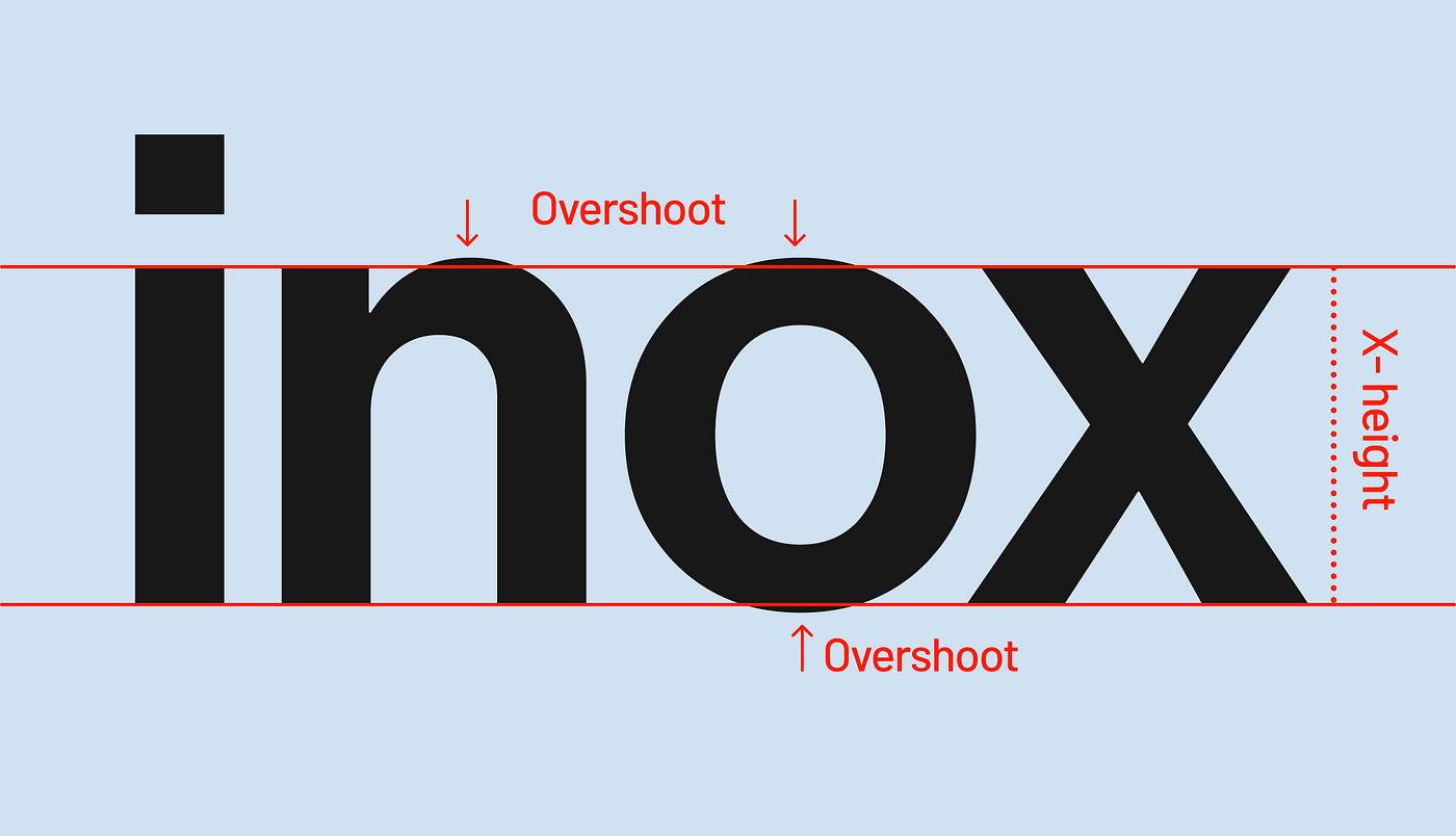
Fig. 2 Overshooting diagram, T.T.Trinkush (2021) (10/6/25)

Letterforms thar share the same structure:

While reading articles on how to create your own font, they often include replicating a few letterforms they have made to make the rest of the alphabet; they have been categorised by Burkholder (2019) on Medium, to which I have wrote down.

Fig. 3 Basic shapes of letterforms (8/6/25)

- Using this as a reference to create my letters using certain letters to make the process more convenient / also if it applies to the font I design.

Dissecting Letters :
An exercise for us to look into the detail on the structure of a letterform to give us insight on how letterforms are actually made, and to show us what we perceive. Letters : H, o, g, b

Font : Janson Text LT Std (Roman)

Capital H :
Fig. 4 Letter H dissection (12/6/25)

- Appears to be symmetrical, but is actually very different with minor changes in strokes / curvature.

- Strokes appear straight and equal in width, but the left stroke is wider than the right by a bit, and are curved inward slightly on both sides. 
 
- Brackets between the stems and serifs are not curved the same, and the bottom brackets take 2 different-sized curves to make it up; from observation, while the top takes 1 arc from a circle to form it's curve.

- Serifs are slightly curved inwards in the middle

- Aside from the cross-stroke and distance between the serifs, nothing else is straight / even.
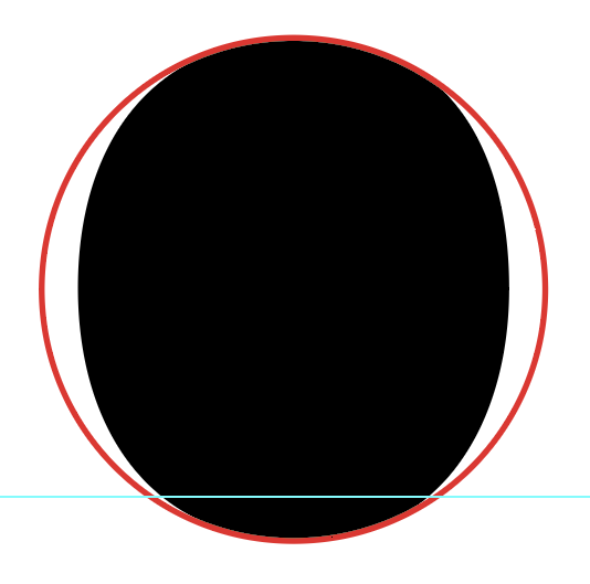

Lower-Case O :
Fig. 5 Letter o dissection (12/6/25)

- Just like the H letterform which appears symmetrical, this letter O in smaller case appears equal on both sides, however is not; it isn't even a perfect circle.

- The strokes that make up the letter o get thinner in the middle, and the curves that make up the circle parallel to each other are slightly different (wider, smaller) 

- The bowl forms a closed counter, which is an oval shape that is slightly smaller on the right side than left (the stroke is thicker on the right)

- Curved letters usually have an overshoot; where the curve exceeds the baseline and x-height to appear the same length as other letterforms
    - This letter should exceed the base and x height by about 1-3% (Karow, 2012)


Lower-Case G :
Fig. 6 Letter g dissection (12/6/25)

- The smaller case G (loop-tail g) has many elements to it's structure -
    - Has an ear that curves into a bulb
    - A neck that connects the head and tail together
    - A tail that loops, which' curve extends the descender (by ≃1-3%)

- The neck appears to have the same shape/curving as the end of the loop just a different scale, but it differs with the shape of the circle/curve


Smaller-Case B :
Fig. 7 Letter b dissection (12/6/25)

- The letter b has a straight stem / slightly curved on the right of the stem (thinner than the strokes of letter H)

- Head serif is slightly curved / stem gets slightly wider as it joins with the head serif
- Bowl creates a closed-counter
    - The curve of the counter on the bottom left is larger than the top left (not equal) 
-  The stress of the bowl is tilted to the left to indicate the thinnest point of the curved shape.


Research / Visual Inspiration:

To start the task and create our font, we had to explore materials / designs and get inspiration to get there. Started off with researching font designs that interested me and developed from there.

Inspiration -
I used Pinterest to find preliminary visual inspiration for fonts, to gain insight for my exploration of original fonts, ad have categorised my takes on the elements of the letter structures to develop and use them later on.

Fig. 8 Serif fonts with additional elements (tails / ligatures / details) (7/6/25)

Fig. 9 Interesting counters / irregular shapes that make up the insides (7/6/25)

Fig. 10 Geometrically structured letterforms (7/6/25)

Fig. 11 Serif fonts with individual features / elements (7/6/25)


Exploration Designs
After getting used to the pens I got, I began to try making different types of fonts using different styles, strokes and elements.

Fig. 12 My explorational designs (10/6/25)


Choosing a Style

Ms. Vitiyaa recommended me to choose a few fonts I liked and combine them. I was leaning towards the serif fonts with the curvy elements / tails as I felt like they have the most personality / originality compared to the other fonts I have explored. 

Fig. 13 Development of chosen style (10/6/25)

- Tried to explore / create homogeneity with the strokes and tails pertaining to certain characters.

Fig. 14 Trying different styles of tails and designs (17/6/25)

- Got to my final design :

Fig. 15 Final physical design (22/6/25)


Digitisation
After finalising my font design, I transferred it to Adobe Illustrator to digitise it.

- Inserting my handwritten font into Adobe Illustrator as a template to create the fonts

Fig. 16 Inserting handwritten design into AI (23/6/25)

Strokes / Guides :

- Used pathfinder to unite all of the strokes / paths together to create one whole object, which is required for transferring the fonts to FontLab 7.
Fig. 17 Outline of structure of letters (1/7/25)

- Kept all of my strokes at the side to use to create other letters; e.g B & P
Fig. 18 Construction of strokes / structure of similar letterforms (1/7/25)

Measurements (Guides)

Fig. 19 Strokes / details of letterforms on the left & guides marking out axises (1/7/25)
 

- Added guides as markers for the Cap Height (C) for caps lock, the x-height (x), and Baseline (B) to create a concise size throughout.

Fig. 20 Labelling of crucial axises & measurements of font (1/7/25)

Measurements (from baseline) :
Ascender: 750 pt
Capital height: 700 pt
Median: 500 pt


Punctuation

Using a post provided by Mr. Vinod - https://www.instagram.com/p/CRjdPtSjz5K/?igshid=MzRlODBiNWFlZA%3D%3D, I have followed that structure on how to develop my punctuation (comma & period) 

Fig. 22 Punctuation array (1/7/25)
Fig. 21 Period analysis (1/7/25)
 
- Fig. 21 = Period is not a full circle.

- Fig. 22 = The collection of punctuation made, made different variants of the hashtag to explore a style that suited my font - Ms. V. said the first option was better.


Final Character Collection 

Fig. 23 Final Character Collection (2/7/25)

FontLab 7

After completing the preliminary stages towards making the font, we had to use Fontlab 7 to digitise our fonts further, and add kerning.

Fig. 24 Putting letters from AI into FontLab (6/7/25)

Kerning

I used the template provided by Mr. Vinod for kerning my letters, and to the right is the outcome of my kerning.

Fig. 25 Kerning template / information (8/7/25)


Final font showcase

Fig. 26 Final font showcase (9/7/25)


_ _ _ _ _ _ _ _ _ _ _ _ _ _ _ _ _ _ _ _ _ _ _ _ _ _ _ _ _ _ _ _ _ _ _ _ _ _ _ _ _ _ _ _ _ _ _ _ _ _ _ _ _ _ _ _ _ _ _ _ _ _ _ _ 

Final Outcome

Curly Tails

- Downloadable Curly Tails Font Link : 

- Initial Sketch
Fig. 27 Final physical design (22/6/25)

- FontLab Process [Side-Bearings]
Fig. 28 FontLab Process [Side-Bearings] (9/7/25)


- Final Type Construction JPEG / PDF
Fig. 29 Final Type Construction JPG (15/7/25)

Fig. 30 Final Type Construction PDF (15/7/25)


- A4 Poster JPEG / PDF

Fig. 31 Final Poster JPG (15/7/25)

Fig. 32 Final Poster PDF (15/7/25)


Feedback

Week 8 (10/6/25)

Specific Feedback : Utilise the KISS principle for font design - make one font less dramatic, and try to mix two that i like / have created together to create a new design.

General Feedback : For task 2, deadline is on the 15th of june, continue with task 3 until week 10; choose your font you want to expand on.

________

Week 9 (17/6/25)

Specific Feedback : Eyeball (?) - forgot the right term - the dissection of the letters to identify how the letter design was built, as for my own font, keep everything general (i.e. only regular, no italics for specific letters), and start digitising.

General Feedback : Finalise the chosen font in this class and start digitising for next class.

________

Week 10 (24/6/25)

General Feedback : Absent - continued to digitise fonts

________

Week 11 (1/7/25)

Specific Feedback : Add detail to letters 'T' and 'I' to be concise with the styles of the other letters, and start using FontLab on your computer first, then try in the D7-04 lab.

General Feedback : Complete digitisation on FontLab by next week in the lab - not on your computer - to get all the features.

________

Week 12 (8/7/25)

Specific Feedback : Must finish your fonts in the lab to start on the poster, for the quote on the poster make it typography related, and since my font has a certain style the quote should also relate to the font / make it look good (e.g. religious / magical feel)

General Feedback : Finish finalising your font in the lab, and by the end of the class you should have an idea for the layout of your poster for submission next week.

________

Week 13 (15/7/25)

Specific Feedback : Make the poster more grammatically correct and add more symbols to create more visual interest.

General Feedback : Finish finalising your blog by the end of today, as well as poster, and submit the final compilation a day before next week's class.


Reflection

Experience : 

My experience for the final task of this semester showed and gave me almost the full experience to create a font, which is ultimately the best way to conclude the module. It was interesting but tedious, where creating an entirely new font had its many challenges, however gave me insight on how creating a font with a full set of characters (letters, numbers, symbols) would be like. Starting to sketch and design the fonts were the easy and fun parts, exploring new styles and seeing other fonts people have made which inspired me to create the font I did, and characterise it myself to give it unique quirks and elements.The tedious part would have been to actually digitise them both in Adobe Illustrator and FontLab 7, with all the details, structure, kerning, etc to look out for. I feel as though the final font I chose to design is not usually a style I'd pick generally, but it was interesting to get out of my comfort zone and explore a different style to create.

Observations :

I have observed that what goes into designing / making a font is a lot of attention to detail, from adding small design details to make the font your own, familiarising yourself with typography terms to create your font, kerning, etc. as well as the 'science' behind type design is very relevant, where human perception is something prevalent in typography, and some illusions we perceive alter the general designs/structures of letterforms and symbols.

Findings :

I have found that after this task my typographical skills have improved since the first task, where everything we learned from there has been useful in the tasks after, and have been helpful in this task as well. In other aspects, my writing has improved through exploration of fonts using different pens and styles, broadening my writing & designing skills in font-making, as well as improving my knowledge in regards to digitising a font using Adobe Illustrator to create the structure, and FontLab 7 to finalise the crucial details to make the font useable. There's a lot of things left for me to learn and explore in typography, however this module in this point in time has shown me a lot on the importance, significance, and appreciation for typography and font design.


References

Abduzeedo. (2024, March 27). Modwood Display Font: A Fusion of Typography 
              Design. Online URL : https://abduzeedo.com/modwood-display-font-fusion-typography-design?

Animation for gigs: 2 logomotion. [Pinterest Gif]. Online URL : 

bojkowski. (n.d.). Everything is relevant. Tumblr. Online URL : 

Bruno Luiz. (n.d.). A94. [Pinterest Image]. Online URL :

Burkholder. J. (2019, August 11). How to make your own font. Medium. Online URL : 

Davodeau. I. (2021-2024). Marseille Jazz des Cinq Continents. Olympic Studio. Online URL : 

DUNYA WORLDWIDE. (n.d.). [Pinterest Image]. Online URL :

DuPont. N. (n.d.). Ascent Font. Online URL : 

grillitype. (2021, July 20). Punctuation, Lesson 29. [Instagram Post]. Online URL : 

itselnacin. (n.d.). [Pinterest Image]. Online URL :

J.WALLPAPERS. (n.d.) [Pinterest Image]. Online URL :

Leasted. (2024, December 1). Vagabond - Handcrafted Font Pack. Online URL :

Rita Phelps. (n.d.). [Pinterest Image]. Online URL : 

Rita Phelps. (n.d.). [Pinterest Image]. Online URL : 

Silvertant. M. (2012, September 28), Typography Series - 01 - Type Anatomy, Deviant Art, Online URL 
            329617642

Simon Lewis. (n.d.) [Pinterest Image]. Online URL :

Squarespace. (n.d.). Colour me quirky. Pinterest. Online URL : 

stephanie. (n.d.). [Pinterest Image]. Online URL : 

Sulaj. R. (n.d.). [Pinterest Image]. Online URL : 

TanType 2398. (n.d.). TAN Waverly. Online URL : https://www.pinterest.com/pin/949133690227558400/

T.T.TRINKUSH. (2021, October 6), Understanding typography: Character space, kerning & tracking, 

Ultimate Collection of Free Fonts for Designers. (n.d.). Philosykos. Online URL : 

Volclair.Studio. (n.d.). [Pinterest Image]. Online URL : 


Comments

Popular posts from this blog

Typography | TASK 1 : Exercises

Design Principles | TASK 3 : Development & Design

Design Principles | Final Compilation