Information Design | Exercises
4.2.26 | Week 1
Haley Alexandra Gray | 0369029 | Bachelors of Design in Creative Media
Information Design GCD60504
Exercises
Table of Content :
Instructions
MIB for Information Design 2026

Exercises
Lecture/Class Exercises:
FLIP 1 | 4.2.26 -
For our first exercise in class, we were tasked as a group to create slides on "what is an infographic?", where we had to include information in 3-6 slides (excluding the cover) such as what it is, what are the types, and what information they display. Unfortunately, only myself and another team member were present, and this is our outcome.
FLIP 1 - Infographic Redesigning
We were also tasked individually for the first week to redesign a badly-constructed infographic poster through our own experimentation. The one I chose is an infographic about the evolution of the brand Apple, and presents a sequence of events / milestones that occurred in Apple as it grew as a company.

Process
- The design tool I used to carry out this exercise was Canva. I started by designing the title (choosing typography and layout), as well as creating the way I would present the data, which would be in a timeline form as I thought it was fitting to represent the sequence of events.
Title Exploration -
For the title, there were multiple fonts I thought of choosing to represent the Apple company, as they are well-known for their recognisable and iconic design elements and choices, such as their prominent use of the fonts Helvetica during 2007-2015, and Apple Garamond ITC from the 80's to the 2000's.

Timeline Creation -
For the timeline, instead of using canva templates I built my own just using line tools as it looked the most straightforward and clean.


- After deciding on my main representations of information, I had to figure out the resolution in which I would display the data.

- I went for the square resolution as it would allow for more space for me to include graphics to represent the data. As I included the relevant graphics, I had also taken and added more milestones that were more up-to-date to modernise the timeline, as well as remove some irrelevant points to make the representation more concise.
Final Infographic Redesign -
.png)
Comparison -
Comparing the designs side by side, there is a stark contrast between business (use of negative space) and the way the data is presented. In the before-design, the events were presented in a very compact and unbalanced way in text-boxes, and in the redesign they are presented in a more spacious way in a timeline format. The overall aesthetics are different, where the redesign utilises more graphics and styles that match the Apple brand, whereas the before's design choices have no reasoning behind it and lack relativity and attractiveness in my opinion.

Personal Rating / Review - Canva
Rating : 8/10
Review :
The design tool I used to create this infographic was with Canva, a tool I am familiar with as I have been using it for quite a few years. It is really easy to use and flexible with its design options and functions (typography, graphics, usability, interface, etc.). It is very easy to navigate the design tools and use them - and I feel that I can do a lot of what I vision with simple elements, as well as images from other sources. Those combined with canva I feel like I can make a lot of things possible. Despite being restricted due to using the free plan, it is still very convenient, useful, and enables a lot of creativity. In terms of the designs / free templates they provide, I hadn't used any as I felt I could do better by myself with the tools provided, and they did not really suit my theme, which makes me reduce their ratings as their options for already-made designs are limited.
_________________________________________________
5.2.26 -
In our tutorial class, we had a group exercise to create a presentation about 3 bad infographic designs and 3 good ones. Our group had a lot to discuss on, where we had trouble identifying good and bad designs as there is a fine line in design, and also we got confused between the differences of posters and infographics.
_________________________________________________
11.2.26 -
In the lecture today we were briefed on Exercise 2, and were discussing about the LATCH framework. For this class we had to make a short presentation on what is LATCH and its components. Those components include Locations, Alphabets, Time, Category, and Hierarchy, and are used to make the data presented more organised contextually and stay relative to each other.
_________________________________________________
12.2.26 -
In the tutorial we had a demo on how to do kinetic typography, and were given a practice exercise to familiarise ourselves with After Effects and motion graphics - where we practiced by adding lyrics to a few seconds of an audio clip. My try :
_________________________________________________
25.2.26 -
In the lecture today we learnt about Miller's law (chunking), and had to find examples of good use of Millers law through different types of design works. We found that Millers law can be applied throughout multiple areas and topics, not just design, and is used to enable viewers to retain information better.
_________________________________________________
26.2.26 -
In today's physical class, we practiced doing vector animations to help us carry on with our final vector animation work. It did not turn out as accurate as what our teacher had done, but it was just a practice and some trial and error, and I think I've gotten familiar with how to do this.
_________________________________________________
4.3.26 -
During the lecture, we got to learn about Manuel Lima's 9 Directive Manifestos, which revolve around not prioritising aesthetics, and taking consideration of other aspects that impact the overall design. The 9 directives are Form Follows Function, Interactivity is Key, Cite your Source, The power of Narrative, Do not glorify Aesthetics, Look for Relevancy, Embrace Time, Aspire for Knowledge, and Avoid gratuitous visualizations.
Exercises 2
Exercise 1: Quantify data (10%)
For our first exercise, we were tasked individually with quantifying data. The instructions are to quantify (count) your chosen items and arrange the objects into a presentable layout or chart. Take a picture and submit! For this task, I chose British coins to use and quantify.
Quantifying Process:
I started by counting, organising and grouping the coins into respective categories before designing the spread they will be displayed on before coming to class.

Design Process:
After quantifying and grouping by face value, then came how to visually present it. It was challenging because this set of coins includes new and old versions of the coins, and size and value are not relative; making it hard to group or present visually.
I opted to forget size as going from largest value to smallest is the most logical and easiest to follow, and have explored several layouts -

- Chose to go for the Venn diagram (inspired) visual as to me it was the most visually interesting and had meaning to it, such as having two sections representing old and new coins, and the coins from smallest to largest descend to the centre and meet at the intersection which holds the most valuable coin.

Final Visual:

Reflection
Experience :
This was the first exercise we had about Information Design and sorting out data and display it visually. This exercise was an interesting way to start the semester and module, and introduced me to the fundamentals of Information Design and what it is going to be about. Not just about visuals, but understanding your data as you present them for others to view clearly. This exercise was quite difficult to get through, but I managed.
Observation :
What I have observed from this exercise is how different the same item can be, and how difficult it is to classify all of them together. I have not thought of coins (any coins, same value, different value, etc) being strikingly different to each other but considering factors like time, usage, origin, design, etc., they are very different, and this made it all the more difficult to categorise as in one of them could be more tarnished than the rest, singling it out and creating its own category. While that feels redundant, it is still a valid classification that you would have to express to show the viewers all the accurate data.
Findings :
While I have been exposed to this type of design before like in high school and other subjects, I found that this exercise specifically, was quite hard to deal with. The first hassle was choosing what object to classify and present visually, as I had a few options but coins seemed the most interesting. The next challenge was separating them into categories, as the coins I picked out had multiple different elements to them, and some did not match with others as in size was not relative to value, etc. So through this exercise, I found out how to overcome those obstacles and create a composition that outlined and grouped their similarities and differences pretty clearly, in my opinion. Something else I found out was that presenting data visually is pretty difficult if you do not understand or know what you are trying to present, and that you need to clearly look at all the information available, to make accurate references and groupings to create the optimal design. I feel as though I had not fully grasped the idea and elements of all the properties of the coins, and so my design feels a bit incomplete, but nonetheless understandable.
Exercise 2: L.A.T.C.H (10%)
In this exercise, we had to develop an infographic based on at least 4 of the LATCH principles. I decided to make mine about the animals in Antarctica, more specifically the food chain and the hierarchy between different categories of animals found there.
The principles within LATCH I went for was Location, Time, Category, and Hierarchy, as listing down animals pertaining to a specific place does not require alphabetical categorising / ordering, and might mess up the factual sequence of how the data is presented - especially in a sequential order that cannot be changed as it represents a chain.
Process
#2. Drawing the contents (Time-lapse) :
Problem :

Solution :

- Changed the layout completely to have the land move to the bottom-ish left, where the hierarchical categories could be presented with the biggest (apex) at the top, which would be the first think the viewers see, followed by the inferior animals down the chain, also representing the chain and their diet accurately.
- Added environmental ranges / rings to connect the location more to the animals, and included them in the legend for easier reading and understanding.

- I could have added the alphabetical structure in my legend, however I still organised the legend in chronological order from producer to apex predator with the appropriate colour boxes that match the circle backgrounds', and not have it be so that the class of animals would be mixed up in the legend, in order for the user to navigate through the chain with better ease.
Final Visual:

Reflection
Experience :
This exercise compared to the first one was more enjoyable and easier to handle in my opinion, as this time we were utilising stated principles to create a composition to display our data, which can be about anything, and I chose a food chain. This exercise was fun to do, and I enjoyed drawing and creating the design elements myself, rather than getting from somewhere else, and could fully make this design how I wanted it to look like. It did not teach me much about composing infographics as I feel that you could recognise how to make an infographic like this without acknowledging the principles, but this exercise helped me to recognise and understand exactly how these principles are put to use.
Observation
From this exercise I have observed that if a location is being used as a way to express information, the location has to be visually expressed in some way or form, and that not all compositions require all LATCH principles to be present as it just might not make sense, for instance in my poster, I could not apply the Alphabetical principle in to my composition as it would misdirect the viewers and mix up the order of the chain. In theory I could apply it in the legend, but it might cause confusion and make it harder to follow.
Findings
I haven't heard of the LATCH principles before, but have been unconsciously aware of them when doing previous design work. Location, Alphabetical, Time, Category, and Hierarchy are all key elements we have all used at least once each time when designing informational designs, and so designing this infographic came like second nature.
Exercise 3: Kinetic Typography (10%)
In this exercise, we had to create a lyric video with moving (kinetic) typography, where we had to choose a song and add lyrics to it. We had to choose a style, colours, and font we wanted to use to create a cohesive video that matches the song.
Chosen Song : MAPS by Maroon 5
- We chose this song as we wanted a son with a strong beat to coordinate our lyrics to better, and to have it intense to convey more feeling
Colour Palette

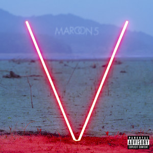
- We played around with the colour palette to suit the theme of the song. Originally, we watched the youtube video and the colours and theme were quite dark, and so we resorted to darker tones. We also got inspiration from the album cover, as well as the theme of the song and intense beat.
- And so, we resorted to 3 colours for a pair, base, and contrast. We chose a dark blue to enhance the dark tones and theme of the music (any other dark colour such as green or purple would not have worked), a beige to make the words pop from the blue and to bring a neutral and complementary colour to the composition, and a striking red to convey the intensity of certain verses and words in the song, as well as contrasts well with the blue.
Font

We decided to go for the font Phosphate, Solid, as it is a sharp, sans-serif and bold font that draws attention and boldness to the screen, which matched the intensity of the song. We did not choose a serif or script font as it would not have went with the theme and style, where the song is somewhat improper, upbeat, and straightforward; and also easier to read at a fast pace.
Style
For the style, we got inspired by other lyric videos and animation styles, where instead of static movements such as the type staying in the same position but fading in and out, we opted for panning for example trying to make it look as though the screen was moving as well, adding more depth to the video.
References :
Inspiration from video :
.jpeg) |
| (Change of colour according to text) |
 |
| (Shapes that visualise lyric) |
Process :
Preliminary Planning :
- To begin, we split up our parts of the lyrics between 7 people :- e.g.

- For my part, I used a storyboard to figure out how I wanted to lay out and transition my text to make the process go smoother, and would figure out how to do them as I made them verse by verse.

Editing Process :
First Verse
This was the start of my attempt at creating kinetic typography after the demo practice in school, so I took what I learnt from that and applied some of the transitions and layouts to it.

- Made text come in from the right, applied easy ease and motion blur, and used the null object layer to move both words up at the same time.
- Something new I decided to do was zoom in on a letter to give the composition for the next words more dynamism, and did that by scaling up the null object and changed the anchor point to where I needed it to be.

 |
 |
- The next new thing I tried out was the text animation "Typewriter" where the text would appear as if being typed. I used this effect to display the word conversation as in people texting each other, and to give the type more personality. I used shape objects to create the text bubble.

- Another thing I tried out was masking layers, in order to create an overlay effect. The scenario which I applied it was to make it as if when the magnifying glass hovers over a certain area, the word will appear; as if hidden and revealed when "searched" for it.

- It was pretty hard trying to figure out how to use it as I needed multiple layers in order to get my desired mask (empty circle in the middle of magnifying glass / background surrounding glass).
 |
 |
Eighth Verse
After finishing the first part, I moved on to one of the single lines, and tried playing with colours and inverting them to fit the text and time it at the right time.

Tenth Verse
This part was the longest part with 5 lines and was the chorus, so I tried to do more things with the composition. What I found was that I can curve text and make it follow a path, as well as use more shapes to my advantage to create a compelling visual story.
 |
 |
 |
| Shapes to represent journey on a map |
This part was about the same as the eighth verse, except a change in words "night" to "time". I just reused the same layout and transitions. But throughout all verses, the same transitions I learnt about such as panning / transitioning out of screen (using position feature); scaling up and down elements; motion blur and easy ease; utilising the null object layer to get all elements on screen to move at the same time; were applied, as well as the exploration of new ones in each verse.
Final Edit:
After compiling each of our works and setting them to the right time of the song, we completed this exercise.

Final Video & YT Link:
Link - https://youtu.be/v2-F5F1w8uI
Reflection
Experience :
For this exercise, it was not nearly as enjoyable as creating static work in my opinion, as that is more interesting to me and I am not very good at expressing motion in my design work, however it was pretty eye-opening to how lyric videos are made, and how typography is made kinetic and expressed differently to static designs.
Observation
From this exercise I have observed how timing and the slightest movements can impact the design visually, as well as how the human brain catches information. It made me more mindful to pace the editing and make it visually clear for the audience.
Findings
I found that different animation techniques can change the mood of the lyrics. For example, fast movements and quick cuts can make the video feel energetic, while slower transitions can create a calmer or more emotional tone. I also discovered how typography choices, such as font style, size, and spacing, play a big role in how the audience interprets the message of the song.
Exercise 4: Animation Charts (10%)
In this exercise, we learned how to animate charts like pie charts, bar charts, and line graphs on After Effects. We were individually assigned a letter that represented a data chart we had to replicate; mine was a donut chart - and so followed the tutorial and made my version of presenting the "overall level of stress experienced among college students".
Process
The first step was getting all the information to start my chart - provided by our lecturers.

- Next, I added the title and began shaping the donut chart to the right size I wanted.

- The data shown is 19.7% for low stress, 1.5% for no stress, 29.5% for high stress, and 49.3 for moderate stress. To calculate how much of the circle for each percentage to show, I started off with 19% to be full and let the rest of the percentages make up the rest of the composition.
 |

- With that being said, 19.7% would appear the last as it finishes the loop the last (100%), and I carried on with what percentage would come next, which is 1.5%, and in the percentage of the circle would be 80.3% (100 - 19.7).
- Then with 29.5%, which would be 78.8% (100 - 19.7 - 1.5), followed by the largest section of 49.3% expressed as 50.7 (100 - 49.3), as the 49.3% section begins from where the circle starts.


- The way I animated the text was use the position tool to make them appear as if coming out from the donut chart, and to get them visible after the donut chart was that I added layers of the background colour behind the chart but over the text so that it appears that way.
 |
 |
Final Outcome -
Reflection
Experience :
This exercise was pretty easy as we could refer to the demonstration video provided by our lecturers to create our visual. I used AE to animate a donut chart that represented the level of stress college students face. The task involved turning a static graph into a moving visual by animating the segments of the chart and the related text. Something not very enjoyable about this exercise that I was unfortunately faced with was calculating how much percent of the sectors should be expressed. Math and percentages are not my strong suit but I did my best. I used keyframes and shape layer animations to gradually reveal each part of the donut chart so that the information could be presented more clearly.
Observation :
While working on the graph animation, I observed that timing and sequencing are very important when presenting data visually. Animating each section of the donut chart one at a time helped make the information easier to understand. I also noticed that using smooth transitions and clear labels helps guide the viewer’s attention to the important data points.
Findings :
From this exercise, I learned that animating graphs is not just about making visuals move, but about improving how information is communicated. Motion can help highlight important statistics and make data easier to follow. I also discovered that I need to carefully plan the order of animations so the viewer can understand the data step by step. This exercise helped me better understand how motion graphics can be used effectively in data visualization.
Exercise 5: Vector Animation (5%)
In this exercise, we began to learn about vector animations, where we animate vector illustrations to make them animated, through the use of After Effects.
Process
The first step was getting the file I would be animating (my category was B) -


- I tried to edit the red shape in the background, but it was not a full shape, and so I tried making it a full shape by duplicating it and adding it at the bottom, so I could rotate it as the animation went on but it did not work how I intended it to so I gave up.

- Next, I moved the layers into After Effects, and began the animation process. I followed a lot of what was taught such as using the pin tool, moving the position of layers and scaling up / down elements, but this was something I was already familiar with from previous subjects, so I decided to try animate as much as I could.
- I began by animating the background before starting with the foreground elements, the background elements being the clouds, fans, dangling things, and flowers at the side.


- Example of use of position tool
Clouds -
- For the clouds, once they slide in they begin to levitate up and down, as I wanted to express how clouds move in a cartoonish-manner. I used the position tool and easy ease to get this effect.
.gif)
Fans -
- For the fans, I decided to use the rotation tool for them to rotate slightly to add some motion to them. And it made more sense to not copy the movement of the clouds as fans are different.. I also tried to make them full circles so it would be more seamless to rotate, but bringing those layers into AE and having them rotate as one, with the anchor points being different as they did not follow the size of the fan vector and was set for the whole composition, it was hard to achieve.

Dangling things & Flowers -
- For the dangling things (I'm not sure what you call them) and the flowers, I used the pin tool to make them sway, as the position tool would only move the element as a whole, whereas I wanted specific parts of the element to move, such as the head of the flower independently from the stem.
 |
 |
Angpao / Red packets (+ Gold Coins & Stars)-
- Coming to the foreground, the main thing in the centre are the red packets, so I wanted them to jump out and expand at you, then return to their natural position to emphasise their presence. Along with that, the gold coins and stars added perfectly to the emphasis effect I wanted to convey, and would animate them to make them appear flowing and emerging out of the red packets.

- Applied the position and scale tool at the same time, so it appears to be growing upwards to be able to be seen within the yellow box.
Gold Coins
 |
 |
- For the gold coins, I used the position and opacity tool to get them to shoot out of the angpao packets at different times for dynamism, and added the fading effect using the opacity tool to make them fade and let a new cycle of coins appear for the 5 seconds to make it repetitive.
Stars
The same principles used for the gold coins are applied for the stars, where the appear and fade in and out around the angpao packets, however I also added the scale tool to make the stars appear big at first and pop out at you. The opacity tool was not used to fade out the stars sequentially, but to add a twinkling effect.

Girl & Bunny -
- The other main elements of the foreground are the Girl and the Bunny. Like the other elements, I made them pop up and bounce in to the frame. After that, they begin to do different animations based on their design.

Girl
- For the girl, after she bounces up, her arm is stuck out in a very obvious manner, and so I animated her hand to be waving enthusiastically to match the whole bright composition. This is where separating the layers came in handy, and I separated the girls hand with the rest of her body to be able to move it independently.
 |
 |
- I moved the anchor point of the hand to be around her shoulder, much like the actual human joint so it was able to move realistically.

Bunny
- For the bunny, instead of having its' limbs move independently through layers, I used the puppet tool to make it nod as it was hard to separate the layers individually. I made the rabbit nod as the head seemed the most separate from it's body, and bunnies don't do much so nodding feels appropriate.
 |
 |
- The bunny also comes with a small red heart which I animated to look like it emerges from the bunny and is beating and like it is a speech so it is being said as the bunny nods.
Final Outcome -
Reflection
Experience :
During this exercise, I used Adobe After Effects to animate a vector illustration provided by the teacher. I utilised different methods of animation taught in class, as well as my own experimentation to bring the composition to life. This exercise was fun to do as I have done something similar to this in the previous semesters, so it was familiar territory. It was not very hard to accomplish, and was a good refresher for how to animate different layers and elements.
Observation :
While working on the animation, I observed that separating layers properly is very important because it makes it easier to animate different parts of the illustration independently. I also noticed that small adjustments in position, scale, or rotation can make the animation feel more natural. The puppet tool was particularly useful for creating flexible movement in certain parts of the illustration.
Findings :
From this exercise, I learned that vector animation requires both technical skills and careful planning. I discovered how different animation tools in AE can be used to create smooth and believable motion. I also found that I enjoy experimenting with different animation techniques, but I need to be more organized with my layers and timing to make the workflow more efficient.
Project 1: Instructable Infographics Poster (20%)
For this project, we were tasked with individually creating an Instructable Infographic Poster, based on a recipe from the youtube channel Pasta Grannies
[how i started / research doc]
[process work]
[final outcome]


Comments
Post a Comment